X Marks The Spot - The New Star Map Is Out Of Beta
Two blogs in two days. I’m on fire!
I have good news! The star map beta has been running now for several months (since the Rhea release back in December) and we are now ready to make the transition out of beta. Starting on April 28th, with the release of Mosaic, we will set the new star map as the default for all EVE players.
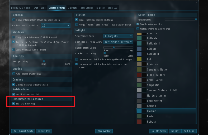
We are close to having all important features from the old map migrated into the new one and are hoping that soon we can leave the old behind completely. That said, we want the transition to be as smooth as possible for you, so for the time being we will be leaving the check box in the escape menu (Try the New Map check box) which will allow you to switch back to the old map. Even with the new map on, you will also still be able to access the old map through the Neocom menu.
While the map was in beta we were constantly adding features, fixing bugs and making adjustments based on your feedback. This release will be no different, so let me tell you about a few of the things we are adding or improving in Mosaic.
Probe scanning improvements

The use of scan probes in the new map was made possible in the last release, but there were some usability issues that needed to be ironed out. As of Mosaic, probing for both sites and hostiles should feel noticeably smoother.
Those changes include:
- You can now double click on results to center the camera on the signature
- Visual indications of results should now persist correctly between scans
- The map will automatically center appropriately on your system making its use in wormholes much smoother
- Performance has been improved
Filtering improvements
We have a lot of nice changes to the presentation and usability of color filters in the map. My personal favorite is extremely simple but brings a huge improvement: we are adding a section at the top of the filters selection box for recently used filters. No more having to scroll all the way to the bottom every time you want to switch from pilots in space to pilots currently docked and active!
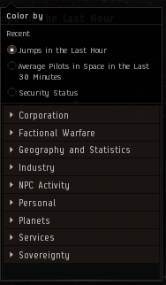
Second, as you might have noticed in the picture above, we’ve rearranged the grouping of filters. At first this might be a little disorienting but we feel this arrangement makes a lot more sense. We’ve also added color filters for faction warfare and sovereignty, which had been missing until now.
Lastly, we’ve adjusted the way filter visualization is normalized. This should make it easier to figure out where that blob is!
Thanks for reading. As always, let us know what you think in the comments.