Improving Photon UI
Why Photon?
Photon is a massive undertaking to overhaul the EVE User Interface. The current UI is functional, so many players have asked why we chose to embark on a large project like this.
During its twenty year development, EVE has seen many features, all with specific user interface needs. Some of these features have pushed the UI into new territory, exploring new ways to improve the interface, but not always with an established design language in mind. This has made parts of the UI less than cohesive, even confusing, and difficult to master. In addition, maintaining many UI styles is ineffective, leading to increased development time.
Last year saw the formation of a dedicated User Experience team, whose primary responsibility would be the in-space experience of EVE Online. As EVE’s user interface allows access to nearly every feature while in space, there was a lot to consider. Efficiency and sustainability need to be considered, not only from a development and technology point of view, but also on a user experience level. This is all a part of EVE Evolved and setting EVE Online up for the third decade.

At this point, all the different UI styles needed to be realigned so the actual UI improvements would build on a solid foundation. This was particularly important given that we would be touching up the interfaces of many more features in the future and tackling one of the most complex aspects of EVE Online's interface: The HUD (which would include the Overview). The different UI styles implemented in certain features over the years were all pulling in different directions, not only complicating design decisions but also causing confusion and frustration for players.
The goal is to make the UI more intuitive, accessible, and coherent while crafting an inspiring sci-fi user experience. As such, a solid design system for the UI was needed and thus Photon was chosen as the first big project. A design system is more than a style guide for designs. It also involves looking at the UI framework and improving the underlying technologies, resolving or limiting any technical debt, and removing as many inconsistencies as possible.

It was apparent that a new way to engage with players to gather feedback was needed, as the UI must serve a multitude of different playstyles and situations, not to mention the vast array of hardware we support. Ultimately, the UI is for the players, and it was important to us to co-develop with them. We therefore felt it was imperative to get the ideas into players' hands as quickly as possible. Test servers are usually only used by a small portion of the user base, in EVE and the gaming industry in general, so we decided to allow players to opt in to test the new features on the actual live server, using their main characters and going about their normal, daily activities. This new approach was formalized into the Feature Previews System, and Photon was released as an opt-in beta in early May.
The adoption rate of Photon UI grew steadily, while valuable feedback was gathered from forums, social media, and many customer surveys and interviews. Based on this, many improvements were made over the summer. In September Photon reached 17% opt-in adoption by the user base, which was substantially higher than expected for an opt-in feature. However, because the UI is such an important and complicated subject, more feedback from a wider audience was needed. In October, we therefore moved to an opt-out approach for Photon, allowing those players who still preferred the classic UI the ability to switch back, but also getting Photon into the hands of users that may not even have been aware of its existence.
Photon has come a long way since that first opt-in release. Here are some highlights:
- A full re-skin of all the UI's base components.
- All the design elements such as buttons, tabs, and window headers converged into a single, coherent style.
- Updated font style and the rules for how it is used.
- A new and more UX-focused color library, with new color themes
- Enhanced sci-fi experience with transitional screen animations
- Compact Mode for all "combat" windows
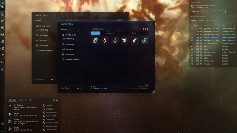
- Many quality-of-life improvements across various feature windows, e.g. Drone window, Inventory Window
At the end of the first day of Opt-Out on 11 October, 84% of players ended their sessions with Photon UI enabled. This number has grown steadily ever since and currently 91% of players have switched to using Photon UI. But we are not done yet!
Multiple overviews are coming!
On 13 December, the Multiple Overview will be available along with a variety of other updates, including settings for window margin size, updated security colors, transparency controls and an auto UI scaling option.

The Overview has been and remains the go-to tool to extract tactical information from your surroundings to stay ahead of the game, and this crucial window is now getting a respectable update.
The headline feature is beyond doubt the new ability to have multiple Overview windows open at the same time, allowing you to tailor the tactical information presented to your playstyle much more precisely than before.
Other improvements include:
- Column visibility, order, and width are now configured and persisted per tab, instead of globally before.
- “Presets” have been renamed as “Filters”, in hope that the clearer terminology helps people better understand how the Overview works.
- Improvements to how Filters are authored in the Overview Settings window.
- Improved Overview right-click menus.
The improved Overview is already available on Singularity (test server). To begin with, the feature is being offered as a separate opt-in (if you have Photon enabled), which you simply enable through the Escape Menu’s “Feature Preview” panel (as with Photon, but no reset of the client is required for this feature).

Other notable updates and additions coming with the December release are:
- Window Margin Size - A setting that allows you to change the size of the margin and header on all windows. This option can be found in the General Settings section of the Settings menu.
- Security Colors - The Security colors have been updated with higher contrast so that they are more distinct from one another.
- Auto UI Scaling - An option in the UI Scaling dropdown that when selected will automatically update the UI Scaling each time the resolution of the client is changed.
- 'Light Background' Transparency Controls - Separate controls for the transparency of windows set to 'Light Background'
- Window Resize Indicators - Indicators in the Photon UI style that become visible when hovering over the edge of a window, which makes it easier to adjust the window size.
- Updated Scrollbar - The scrollbar in Photon UI is now static and no longer expands and collapses when hovering over it.
These updates are aimed at addressing some of the main areas of improvement pointed out by the community. Thank all of you that have been a part of this back-and-forth process, as it is an integral part of the process of developing a kick-ass user experience. As always, any and all feedback is appreciated!
o7
Please Note: Due to the number of changes and improvements made since the Opt-Out release in October, we will be resetting the Opt-Out state of all clients on December 13th. If you still wish to use the Classic UI instead, you will need to opt out again. We hope that you give the new improvements a try and then give your feedback on our forum: Multiple Overviews Feedback Thread