Neo NeoCom
Comparing this ancient screenshot of the EVE client to what we are currently used to stare at day in and day out reveals many interesting things. During those 7 years that have passed the ship HUD has had a substantial facelift and the threats window has grown up to become an overview. One of the few things that hasn‘t changed much at all, if at all, is the NeoCom. During those early days of New Eden the NeoCom did its job just fine, but as EVE has grown with every expansion delivered, it has become more and more obvious that a more elegant solution is needed to allow for easier access to the tools and features we use on a daily basis.
So we did this:
The two major aims of the new design are to increase customizability so pilots can configure the NeoCom bar to fit their daily needs as well as making the ever growing number of features in EVE more easily accessible.
The EVE menu
This is where all the features in EVE can be accessed at all times. It‘s not customizable; that‘s what the NeoCom itself is for. The introduction of the new group structure means that we don‘t have to hide new exciting features under a tab in a semi-related window because there isn‘t more space in the NeoCom.
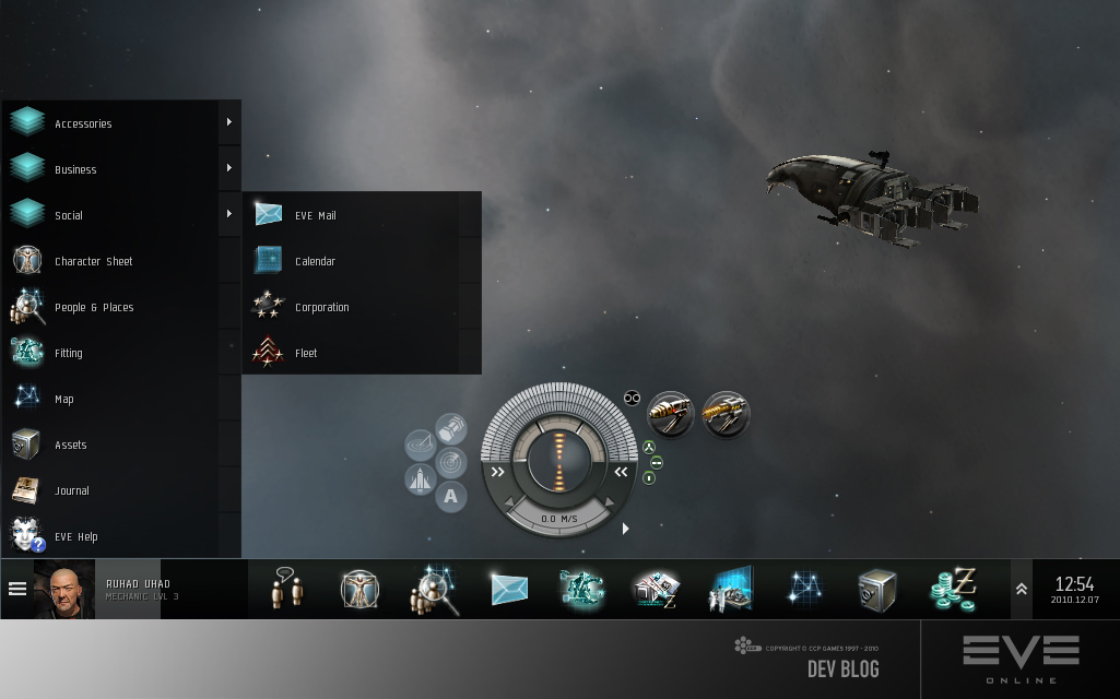
Customizability
The customization of the old NeoCom was very limited to say the least, but no more. You‘ll now be able to decide exactly what buttons are displayed in the NeoCom and reorganizing the buttons is as easy as dragging them around. Removing a button from the NeoCom is a right-click affair and re-claiming that same button is as easy as dragging it from the EVE menu into the NeoCom bar. It is even possible to create groups into which buttons, and other groups, can be dragged.
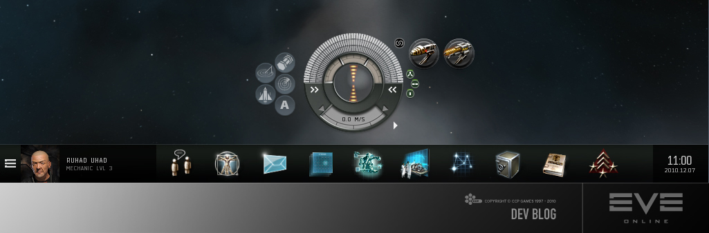
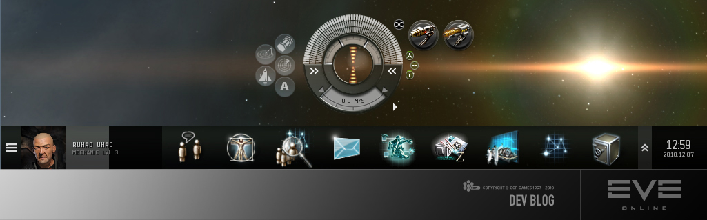
The size of the new NeoCom is also configurable by dragging the top border, ranging anywhere from this:
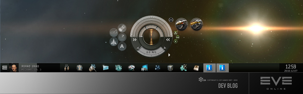
... to this:
Other features
- A skill training progress bar that also allows for one click access to the skill training queue
- The old "minimized window buttons" functionality is replaced by displaying icons of all open windows in the NeoCom. Windows of same type (multiple "show info" windows for example) are grouped together into a single button.
- Buttons with special functionality:
o Chat: Groups all currently open conversations and has a button for directly accessing the "channels" window.
o Browser: Lists all bookmarked sites, making them easily accessible.
It‘s still in BETA
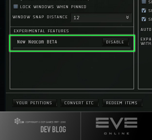
Releasing new features as BETA before fully integrating them into the game is a new concept we at CCP are trying out and the new NeoCom will be one of the first features to get such royal treatment. The idea here is to make the introduction of new features a smoother experience, both for developers and players. To enable a BETA feature, one must go to the "General settings" tab of system menu (ESC) and press the relevant button in the bottom left corner. Should this iteration of the new feature not meet your expectations, you can simply turn it off for the time being and tell us why you did so on the forums. Even though SISI has proven a great play testing tool, we feel confident that trying out new features on TQ where you are actually playing the game will provide better feedback than we‘ve been able to get in the past.
We already have plenty of ideas for iterations beyond the BETA, such as allowing alignment to any side of the screen, customizable names and colors of groups and adding more visual polish but we want more! Is there anything blatantly missing from the current design? Are there windows you would like to be directly accessible through the EVE menu? Do you have an idea for a special NeoCom button that would make your life easier? If so, please don't hesitate to tell us on the forums (and we might listen).
The new NeoCom BETA will be hitting TQ as part of the main Incursions release, January 18th 2011, and SISI before Christmas.
CCP Optimal