A new look for EVE’s UI – feedback needed!
On behalf of Team Game of Drones and the EVE UI Group, I am here to tell you about a new look for the EVE UI that we are working on. It’s a big revamp of the look of the whole EVE user interface – while keeping the functionality almost entirely the same. The current look dates back to around 2000, and we want to make sure EVE looks like a modern and beautiful game, but also that you have an interface that helps you do what you need faster and better.
The look brings a new kind of blurred window transparency that lets you see the scene behind UI windows much better while still clearly seeing the contents of the UI. We have also made a new icon set that is designed to let you find and open the right windows faster.
For the look itself, we want EVE’s UI to look and feel more like something fitting a science fiction universe, and a bit less like an operating system.
Here is a screenshot to give you an immediate idea of the new look:
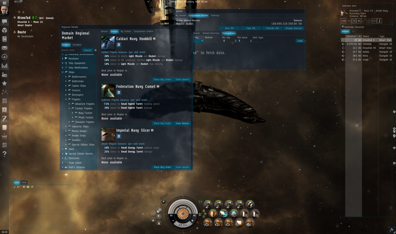
(click to enlarge)
We realize it’s a big change, so to make sure we get enough feedback from you, we will bring the new look to Singularity today so that you can see it in action and help us make sure all the functionality you need still works well with the new look. Read ahead for more on the background and our vision for this project, and how you can give us feedback!
Background
Even though we feel we‘ve really picked up pace with various quality-of-life interface fixes and improvements throughout the last few years, as well as raising the bar quite a bit with usability and visual intrigue of new features, we have never attempted to do an overhaul of the look and feel of the UI as a whole. That is, until now.
It all started with a project called EVE UI Modernization. The UI Group came together in an Icelandic summer hut way up north (beyond the wall) to define a vision for a new and better EVE UI. In that effort we asked ourselves what “better” means and found out it was a combination of many components that all had to come together in a holistic way. The group came up with a strategy to push the UI into a direction of having a better identity, better functionality, better usability and better aesthetics.
The first efforts where Initially kicked off by a couple of individuals on the UI Team as conceptual work and has been ongoing behind the scenes for quite a while now and has recently been adapted by Game of Drones to push it all the way to Tranquility with ongoing support from other UI developers.
The goals
For the sake of clarity, I have prepared a list of the goals we set out to reach with the UI Modernization effort.
- Roll out a complete new UI that will define the visual direction for EVE UI in the coming years
- Less operating system, more Sci-Fi, and militaristic looking UI
- Functionality and usability should feel modern and intuitive
- Have the UI complement the beautiful New Eden view, instead of blocking it.
- Better consistency between UI control look and feel.
- Use colors in a sensible way.
- Simpler, and more recognizable icons with a clear distinction between icons that represent items vs icons that represent UI controls and labels.
Now, let me explain a bit further.
Look and feel
Our UI designers didn’t have to meet for long to reach a consensus that they wanted the UI to look more holographic and futuristic than it currently does. For interacting with the UI, instead of using skeuomorphism (a word I’m pretty sure to have been invented by a certain fruit company that shall not be named here) such as having a button feel like an actual button when pressed, we want to use burning light and glow to indicate button presses, blinks and such. Here is a part of their vision statement for the EVE UI Modernization project:
Everything is made from light and behaves similar to light. Objects are dim and darkened or de-saturated when off/inactive instead of just alpha faded. Objects flicker and offset when under damage, power out, power disruption. Objects are drawn in, they turn on and flicker slightly to immitate a more realistic, mechanical state. Retro references used by the group was things like Jet HUDs, LED gauges, oscilloscope / vector scope, lasers, spectrum analyzers in 70‘s stereos.
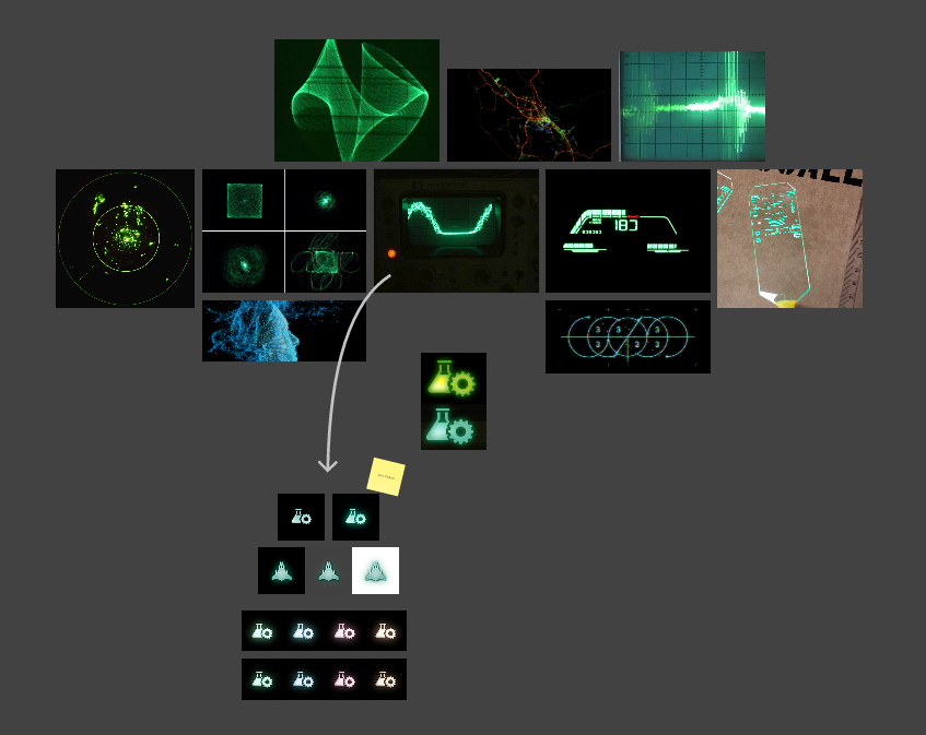
(click to enlarge)
The re-skinning of the UI and updating of UI component and menu icons is just the first strategy step in fulfilling this vision and will pan out more in the coming months. We wanted to make a clearer distinction between windows and interface elements, so the Neocom, Overview and Station Service Window, all integral parts of the interface and always visible, will feel less intrusive than windows that you open, use and close.
What can we learn from the dinosaurs?
Practically nothing. They weren’t exactly brilliant now were they? That is unless you’re talking about shader programming. We’ve always felt it’s a shame how good of a job our UI does of concealing the space scene. Sure, we have window pinning, but the simple transparency effect will in many cases render the contents of the window in question un-readable. So, in order to solve this, we’ve placed a blurred, de-saturated and brightness-filtered see-through background behind all windows. What this effectively gives you is T-Rex vision (bingo), as one of my co-workers branded the feature, as you can’t really make out the background details, but can still quite easily make out movement and bright spots. What we’re hoping to achieve with this is giving you better sense of what’s happening in the space scene, even though it’s completely blocked by windows, without having it compete with the content of said windows. Pinned windows are only blurred and slightly brightness-filtered, making them even more see-through. In addition to this, we’ve introduced three states for windows: 1) Active state, 2) Inactive state and 3) Camera drag state (triggered for all windows when you move the camera around) where each state is more see-through than the one before. The logic here is that by selecting a window you’ve stated that you’re more interested in its contents than in other windows, or what may lie behind it, and that while you’re moving the camera you’re stating more interest in the scene, and less so in the windows.
Flying colors
Black on black has its charm, but we were quite interested in unlocking more color themes that actually made visual sense. For that to happen, we’ve completely redefined, simplified and clarified how UI color is selected and applied. First off, you have the base color, which is applied to the window backgrounds and secondly you have a highlight color that is applied to intractable elements, such as buttons, checkboxes, as well as being used to colorize the glow of iconic buttons, such as the ones in the Neocom. We’ve completely redone the color themes, limiting the base colors to dark tones while allowing the highlight ones to shine a bit brighter. Simple theme selection will be replacing the old RGB sliders and dropdowns.
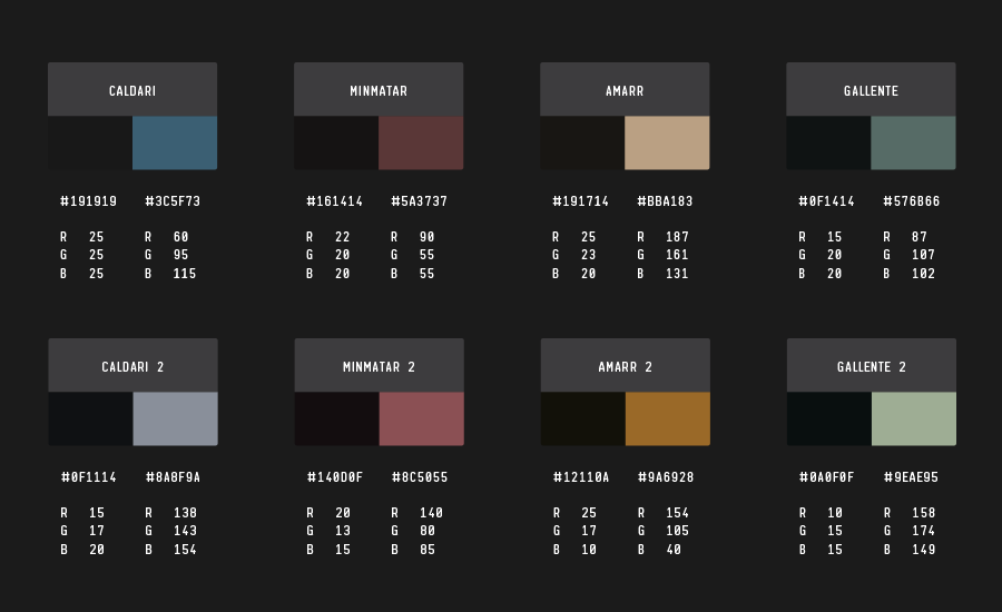
(click to enlarge)
The above example is just a preview of the current themes we are exploring but the main idea is to have themes that fit for all the major factions so that you can immerse yourself into the branded interface that fits your ship or your preferred faction. Let us know what your preferred colors and factions are.
Skinning the beast
As if all of this wasn’t enough, we’ve additionally re-done most of the UI control skins. This includes windows, buttons, checkboxes, scrolls and tabs. Instead of excessive yapping, I’ll let the following pictures do all the talking.
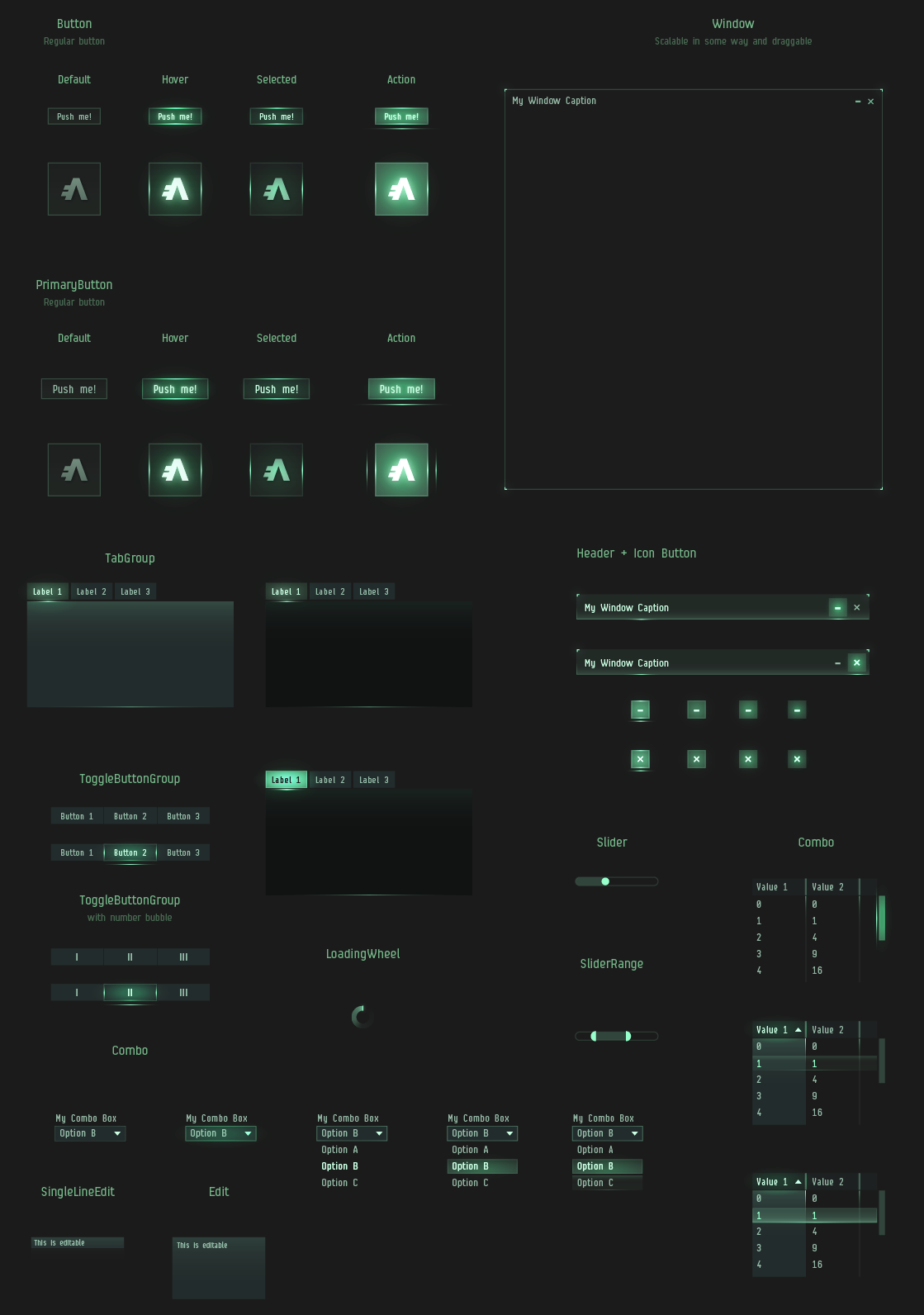
(click to enlarge)
Iconic icons
Last but not least, we’ve completely re-done all window icons. The brightest reflection of this change is to be witnessed in the Neocom. We are introducing a whole new set of modern, monochrome, clear cut icons. I’m going to go ahead and predict that some of you are already thinking; “Strip all color! Are you insane?”. Although I can neither confirm nor deny any claims of insanity, I can assure you that once you’ve learned the new icons (which takes practically no time at all) you’ll be opening windows faster than ever before. As a matter of fact, it has been scientifically proven that stripping color away from such icons reduces search time, as it allows your brain to focus purely on form. It’s a “try it to believe it” kind of thing. I was skeptical at first too.
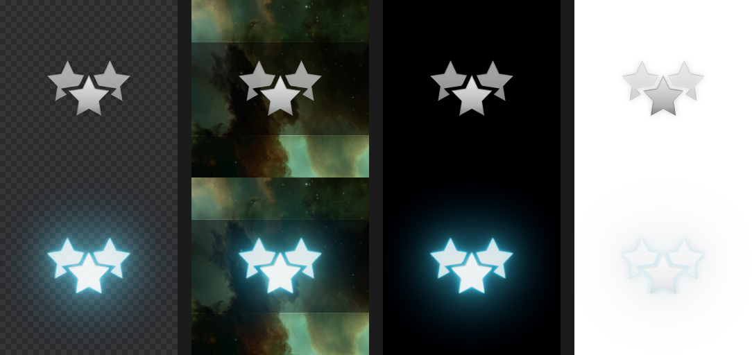
(click to enlarge)
The above example is to show the normal state and hover state of the new Neocom icons. The shapes of the new icons are all very much on the operating table still but we wanted to get some version of them on SiSi to start having a conversation with you on their shape and style. We recognize that the old icons have been part of the game from the beginning and have a special place in our hearts. We want to make sure they can be remembered and will make sure the collection will available to download as a .ZIP file after the update for those that want to own a piece of EVE UI history.
And finally
What we want the UI Modernization project to achieve is forming a really solid visual foundation to build on. There are still various things that will not get touched this time around, but having a stronger foundation will make it that much easier to sculpt prettier things once we get there.
These changes will be on Singularity today. There is still a lot of work to be done, so please take it for a spin and give us your feedback on the forums. We’re currently aiming to get the final thing out with the Rhea release on December 9th.
Enjoy your spaceships in a responsible manner.
- CCP Optimal