Remember the old new Neocom?
A year ago we published this devblog, where we made all sorts of promises about a brand new, customizable neocom. Well, better late than never, right? To begin with, I would like to apologize for the latency and assure you that the blog was in fact not a poorly timed April fool’s joke. We did decide to push the Neocom project a bit back, as we felt it hadn’t received all the love it needed, and then, well, last year happened, so the project kind of got lost in all the turbulence.
Most of the promises made in the old devblog still hold. You will now be able to fully customize the Neocom according to your own play style; If you never use, say, the Corporation window, you can simply remove it from the Neocom. If you later get dragged into some serious Corp business and feel the need to put the Corporation button back in front, you simply drag it back from the EVE menu, which is accessed by clicking the new “E” button at top of the Neocom or pressing the appropriate shortcut key. This menu holds pretty much all the fundamental windows of EVE that can be accessed globally, all of which can be dragged to the Neocom for quicker access. What’s also cool about this new design is that we can stop placing new windows and content at weird locations, just because there isn’t more space in the Neocom. Instead, we just add a new entry to the EVE menu and let you decide if it’s useful enough to deserve its own Neocom button. We’ve already added a few new buttons, such as Agent Finder, Certificates Browser and Sovereignty.
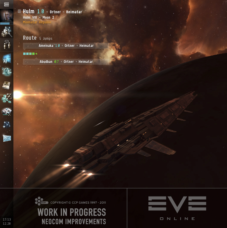
Our previous attempt to upgrade the neocom looked something like this:

Click to enlarge
But a lot of people felt it should have looked more like this (warning: photo may have been digitally enhanced by a programmer):
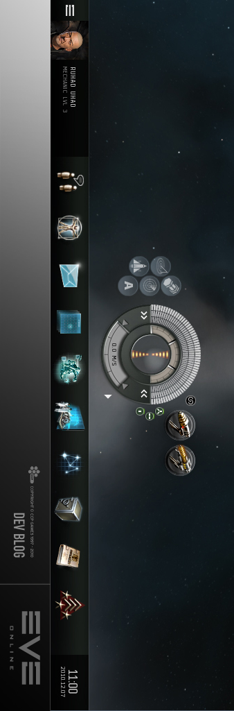
And for this very once, we decided to listen to you guys! (but this is the last time, ok?):
Click to enlarge
Yep, it’s a full 100% more vertical than before. The heartbreaking part (for some of you at least) is that for this first iteration, you’re only going to be able to have the Neocom aligned to either left or right and not top or bottom of your screen. The main reason for this is lack of time, and we’re hoping to add this feature later on. This raises the obvious question of “Erm … didn’t you already do the horizontal implementation you lazy excuse for a dev?!?”. While the answer to that is obviously yes, writing the code that supports BOTH types of alignment just takes a bit longer than writing code that only does ONE. It also takes much longer than rotating an old image of a Neocom (see above). It can obviously be done, but just takes a bit of time. Prioritization and all that boring stuff.
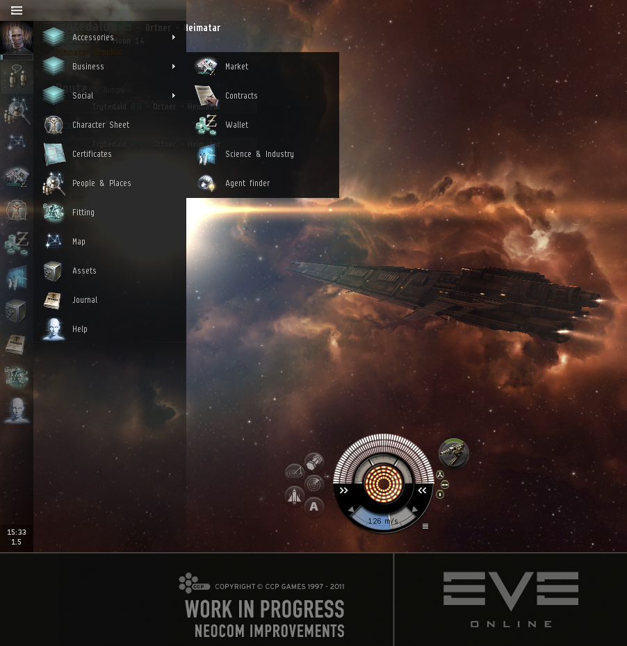
The time we HAVE had we’ve used to properly polish the Neocom, adding smoother button effects and animations (screenshots are not the optimal medium for showing off that kind of stuff, so you’ll have to take my word for now), and making the EVE menu look less operating system, and more space game so it’s not likely you’ll encounter many strips of buttons sexier than this. The Neocom now also takes care of hosting minimized windows, so the unreadable slab of buttons that formed at the bottom of your screen is gone forever. We’ve also changed the toggle-close window behavior of the Neocom buttons to toggle-minimize. This, accompanied by a smooth new minimize-animation that makes it easy to follow where your window was minimized to, we’re hoping to make minimizing windows a more feasible action in the war against windows. Not the operating system, but this:
This time around, we’re not releasing a beta version, so what you see above is what you get on TQ and the “when” is this January, as part of the Crucible 1.1 release. In case of force majeure, you can at least look forward to a brand new version of this devblog in a year’s time.


New to EVE? Start your 14-day free trial today.
Returning pilot? Visit Account Management for the latest offers and promotions.