Bracket Icon Madness - Feedback on the new Overview Brackets
Carnyx recently brought with it some big changes to familiar icons. Players logged in and suddenly found all the things around them were the same… but different.
The bracket icons for everything in space and on their overviews had all suddenly changed. The great Iconocalypse of 2015 had occurred and new icons arose in the place of those which had fallen:
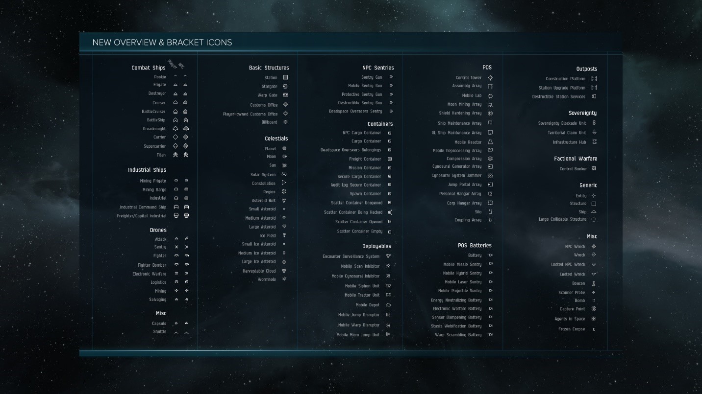
(click to enlarge)
But... Why?
After the initial psychological adjustment period of the new icons had passed, many of you rightly asked us: why had we decided to overhaul the bracket icons to begin with? There wasn’t anything imminently bad about the previous set, players were used to them, and had gotten accustomed to staking their situational awareness and expensive ships on quickly recognizing the tiny differences in square sizes and cross thicknesses that defined ships on grid for years. So why the change?
To answer that better, these were our initial goals for the update (some of which were laid out on the first devblog many moons ago:
-
Improving player’s situational awareness and reaction times in combat.
We wanted to give players more icon granularity within ship groups and items. And we wanted to increase the skill ceiling of reading the grid at a glance, so that players who learned the expanded set of icons had a distinct battlefield advantage. -
A clearer system for identifying different objects in space.
Intended for veterans and newbies alike to be able to better read situations and assess threat levels. A cruiser and a battleship represent wholly different tactical scenarios, yet both had the same icon under the old system. Additionally some objects didn’t have any icons whatsoever, and many fundamentally different objects had used the same base icon for years. -
Unifying the iconography with the ship tree in ISIS.
This one was aimed primarily at newer players who are familiar with the Interbus Ship Identification System (ISIS) for learning the vast number of ships it is possible to fly and encounter. Thus having the in-space brackets of the ships they encounter match the ISIS tree was an important connection to make. Initially our plan was to migrate the old ISIS icons into the brackets, but our testing and feedback showed us they were simply not designed to be usable at the small bracket scale. So we made a completely new set that could be used at both scales and simply ported it over to ISIS. -
Catering to several years of feedback telling us the old bracket system, separating ships only by size categories, was not as useful as it could be.
While this has been hotly debated since, especially on the distinction between categories: player and NPC ships, and ships and drones were arguably clearer with the original brackets (more on this below). But initially this was a guiding goal.
That’s the why of the update to bracket icons. Now let’s get into the how.
**A Method to the Madness **
The many in-space entities you can encounter in EVE can be categorized in numerous ways, and along different axes. We knew we needed a system of underlying rules for managing the expanded set of icons so that certain heuristics, or groupings, could be identified at a glance.
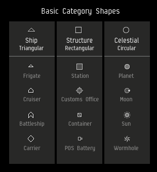
This began with the most high-level separations, for which we assigned a basic shape profile:
- Ships (Triangular) - Can move, are manmade.
- Structures (Rectangular) - Are immobile, are manmade.
- Celestial Bodies (Circular) - Are immobile (technically speaking), were birthed in the big bang.
Another super important axis of distinction was between entities that were player controlled vs. NPC/AI controlled. After several explorations we settled on NPC entities having the same base shape, but with an inner fill compared to their player-controlled counterparts.
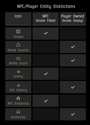
It’s important to note that initially the reason we decided NPC entities should be filled-in and player entities should be wireframes was that players could gather in potentially far larger groups. And with large-scale blob engagements it was important to keep their icons as “light” on pixels as possible to maintain readability.
UI Scaling at 90%
Releasing the thin wireframe icons accentuated the fact that the UI scaler does a suboptimal job of reducing 1-pixel strokes to less than a pixel. This resulted in a worse experience for a certain segment of players playing at 90% UI scaling, who ended up having a markedly worse experience with the new icons.
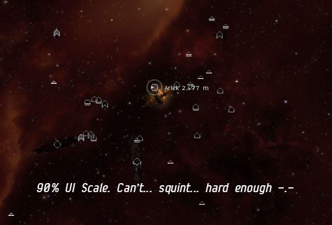
EVE UI has always been designed with pixel-perfect accuracy at its core. And when we decided to introduce a UI scaling option for accessibility reasons, we did it for the sake of giving people options to customize their UI, yet with the known tradeoff of knowing the texture scaling would create less than ideal-looking experiences in certain situations. It was by sheer luck that up until now most of the other issues created at 90% happened to be manageable, but the new bracket icons were so gameplay-critical that it made for a step back in usability for those playing at 90% scale.
Mea culpa to those affected. Making the icons at least usable at 90% scaling is one of our top priorities for improvement, along with others outlined below.
Next Steps
The new icons brought major change to the way in-space entities are represented in EVE’s UI, but we’ve also identified several areas of improvement thanks to your feedback. Here are the top items on our list to tackle:
Improve Scaling issues
- We’re looking at way to make the icons more useable at 90% scale in the short term while a longer-term technical solution to UI scaling is being developed.
Improve NPC and player ship distinction
- We agree with much of the feedback that the subtle interior fill to indicate NPCs is simply not drastic enough, so we’re looking at other ways to make NPC brackets more clearly identifiable compared to player-controlled ships.
Improve drone distinction
- Another common feedback was the drone icons were still too complex and easily confused with ships. We’re also looking at ways to make drones on grid easier to separate from ships at a glance.
Add icons to overview customization
- We’ve heard the most benefit from the new icons was gained by those with properly managed overview setups. We’re looking to add an icon column to the customization window, to make it super simple to understand which items you want the tab to display and how. This will also double as an in-client legend and visual guide to learning the new icons faster.
We are aware that a sudden and drastic update to some small but very important space symbols may have inherently vaporized several trillions of ISK from the economy. As pilots undocked expecting their familiar foes to be square brackets and crosses they unexpectedly came under attack by chevrons, diamonds, and house-shaped adversaries armed to the teeth. Some were so spooked and disoriented they began to fire on any geometric symbols in their vicinity. Others believed they were being attacked by their own warp bubbles and returned fire… Those that managed to adapt quickly in the early days of the great Iconocalypse of 2015 certainly profited handsomely from the confusion it sowed.
But in New Eden space is merciless, and change is ever-present.
- CCP Surge