Project Discovery - Level Up!
Greetings Capsuleers,
It’s time to level up and push your Project Discovery performance to an even higher benchmark, as the data coming in will now be more complex, resulting in even better learnings for the science community! As immortal pioneers of New Eden, you have surpassed even the highest expectations for this project already, and those were expectations earned through your stellar performances in previous incarnations of Project Discovery.
“We have been working on Project Discovery for 5 years and it is amazing to see how the EVE player community even after all this time keeps tirelessly participating in research efforts. This contribution is especially important and valuable in these pressing times. Thank you all!” - MMOS CEO and co-founder Attila Szantner.
In designing and implementing this latest version of Project Discovery, a lot has been learned about flow cytometry and cell populations to make the content engaging while also delivering accurate results to our scientists. Given that 39.6 million submissions have been amassed since the project’s launch, it’s safe to say that EVE Online’s players have answered the call to arms in the fight against COVID-19.
“The participation and quality of the data produced by the EVE community has been truly amazing and exceeded all our projections. We are thrilled to be able to mine this unique source of wisdom for the immediate benefit of biomedical research” - Jérôme Waldispühl, Associate Professor, School of Computer Science, McGill University.
With 466,000 already verified and now able to be used in scientific research, it’s also fair to say that this is a quantity and accuracy of data that would not exist without the efforts of EVE’s dedicated players around the world, but with so many samples still flooding in, it’s time to level up the accuracy.
When the project was launched, the main aim was to teach you how to demarcate unique populations in flow cytometry graphs while sending the end result of your efforts, the analyzed graphs, to CCP’s partners at UNIMORE, MMOS, McGill, and the University of British Columbia who would then use that data to understand COVID-19 better. Solid progress has been made on that front, which is fantastic, and if you’d like to learn more about that, then give this podcast a listen or visit McGill’s website about the project. That said, it was always known that at some point in time the approach would need to be refined, and it turns out that that time is now.
“EVE Online players are doing an exceptional job. The accuracy of their analyses is very high, which demonstrates the extraordinary attention that is paid to what is actually not just a game but a real fight against COVID. Players from all over the world are proving that collaboration with scientists is absolutely successful and that together we can do a lot, in a very difficult moment in which the uncertainties are much greater than ever.” - Dr. Andrea Cossarizza, Professor of Pathology and Immunology at the University of Modena and Reggio Emilia School of Medicine in Italy.
While Project Discovery participants have produced invaluable flow cytometry data over the past three months, after our scientific partners compiled your submissions and looked them over with their decades of laboratory experience, they have now issued a challenge for you to produce even more accurate graphs. To do that, though, you will need to learn a few additional things about flow cytometry and the plots being used, as well as what could be done better.
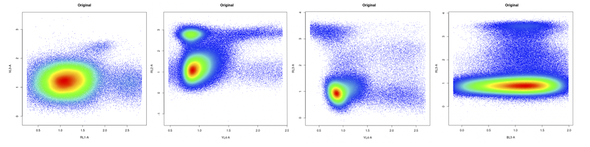
For most of the Capsuleer-analyzed plots, the data being produced is the gold standard of gold standards. Anything that looks like the following graphs is already being analyzed adeptly. Don’t change your approach for these.
The hope is to improve clustering in charts that look like these two, which are more difficult to properly analyze because of the peculiarities involved in turning real-world blood and cell samples into 2D plots.
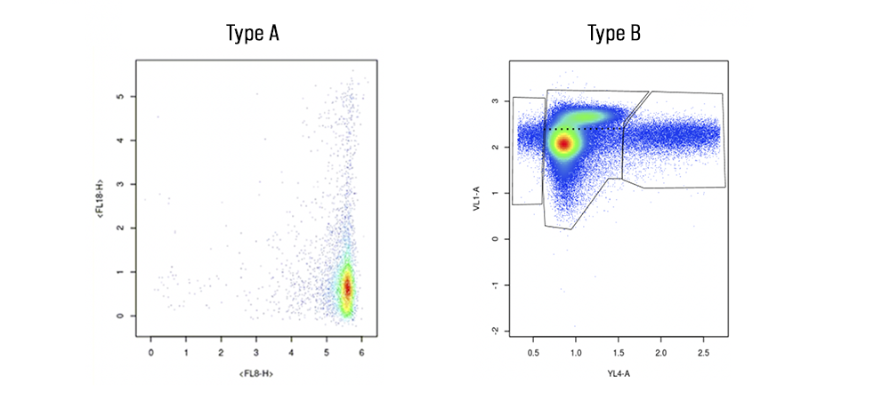
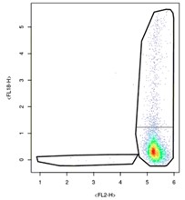
It’s best to start by talking about what makes Type A samples unique: their fancy tails. Known as ‘smears’ in the world of flow cytometry, the thin band of cells on either side of the high-density cluster contain valuable information about how COVID-19 impacts cells. The presence of smears mean that cells are maturing slowly and that there are several cells in-between new and mature. In short, there are a lot of cell types present even though there aren’t that many dots on the plot. Figuring out where the populations are, that is, where the ‘clusters’ of cells are, is incredibly valuable when trying to understand viral impact on cell populations. These kinds of plots are a big deal and while it does not appear that there is a lot of information on them about cells, there definitely is.
Type A samples are also tricky to interpret because of a design choice made at CCP in tandem with MMOS and the scientists, namely, to remove the interval marks on either side of the plot. The removal of the labeling of these graphs was done in part to combat botting and in part to make a more streamlined user experience. That included removing the tick marks, which matters because all the plots we’ve been given are mapped on logarithmic axes. This means that as the number on the interval mark gets bigger, there are exponentially more proteins present at that portion of the cell. One dot becomes 1000 proteins at the tick mark labeled “3” on the Type A sample. Essentially, one dot at the top right of the plot is equivalent in protein amount to thousands of dots in the bottom left of the plot.
So how does this impact Capsuleer clustering? Simply stated, it is important to make sure to separate smears from high-density clusters. Instead of producing charts that look like this…
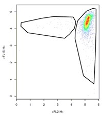
…we need to instead produce charts that look like this:
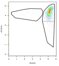
Doing this is relatively easy on plots where the side smear aligns with the high-density cluster like above. In this case, just demarcate the bottom smear by aligning your polygon with the lower end of the opposite smear. Try to mirror your clusters. Where it gets to be a bit more complicated is in samples like this:
In this sample, the side smear to the left is much smaller than the other and would cut straight through the high-density cluster if mirrored. Don’t do this. Instead, think of these samples like comets, where you’re trying to separate the tail of the comet from its body. Doing so will produce even more valuable data about these particularly unique cell populations.
Comet plots aside, it is also important to address the Type B graphs and how those can be better clustered. As seen above, these cytometry plots look like an amalgamation of cell populations. Until now, Capsuleers have done an excellent job of demarcating the left, right, and middle of Type B charts. However, you’ll notice that there is a cluster of data points sort of sliding off of the high-density area. Think of these as rogue cells, vying to break free from the larger cluster. They need to be categorized as a separate group accordingly.
To do so, one must simply mark the polygon at the thinnest point of separation between the two clusters. When that cannot be easily determined, try to mirror each cluster off the other and draw a separating line through the middle of the mirror.
All of this said, it is beyond impressive how many robust samples EVE Online players have submitted thus far, and there is no doubt at all that you’re up for the challenge of more accurately demarcating Project Discovery’s trickiest datasets yet.
“This project is crashing through all my expectations, with players continuing to show great engagement and interest in the work we are doing, as well as providing huge amounts of high-quality data for our research. Their efforts will not only contribute to the understanding of COVID-19, but the data they are generating will also be freely and widely shared with the entire scientific community. There is very high interest in re-using their results for the generation of machine learning algorithms. There is simply no other resource out there for this anywhere close to what is now being generated.” - Dr. Ryan Brinkman, Professor in Medical Genetics, the University of British Columbia, Distinguished Scientist at BC Cancer.